No excuses! You should be testing your product with users.
People care more about eXperiences than features; in the market, 1 in 5 products fail due to an unfriendly product eXperience.How can we prevent ourselves from this awful fate?
Give users what they need, duh!
It seems simple, yet we’ve seen company after company get this wrong; they don’t include the user in any stage of their product creation. In fact, a McKinsey study showed 40% of the surveyed companies do not talk to their end users during development.
Without an understanding of what the user needs are, how can a company hope to add value to their users?
Welcome to the world of user research! To help make the user research process more approachable, we’re starting a series, the Founder’s Guide to UX Research, where we break down methods that will help you and your product team understand your users, improve your product eXperience, and exceed your business goals.
Let’s begin! Today’s topic: usability testing.
What is usability testing?
To give your users what they want, it can be as easy as finding them and asking. If you aren’t familiar with the term usability testing, here’s the gist:
Usability testing is a fast and effective way to test how well your product will work with users and should ideally be done before products are released to the public.
Testing with merely 5 users can capture up to 80% of all the usability issues in your product, significantly decreasing the risk of launching an unintuitive product.
What outcomes can you expect?
Usability tests are best for:
- Seeing how easy your product is to use
- Validating if you made the right design decision
- Assessing how your product compares to others
Usability tests must be done when you have a prototype that can be shown to users. The prototype can be of varying fidelities — from sketches to developed prototypes. Since testers may differ in their understanding of sketches versus prototypes, the quality of the feedback is directly correlated to the fidelity of the prototype.
Sometimes, a “smoke and mirrors” prototype may work just as well as fully functional software in testing.
Unmoderated vs Moderated: Benefits and Constraints
Depending on the time and budget you have available, you can choose between two common types of usability testing:
Unmoderated usability testing
In an unmoderated usability test, prototypes are uploaded into a tool such as UserTesting or UserZoom, and participants are prompted through the study at their own pace. Researchers then watch and analyze the videos to extract insights.
Benefits:
- Highly time efficient — Since the studies are done on an online platform, recruitment time is significantly decreased, and all studies are typically filled within an hour.
- Wider reach of participants — Online distribution of the study means that geography is not a constraint.
- Cost-effective — Unmoderated studies are typically 15–30 minutes, and are about one-third the cost of conducting a moderated study.
Constraints:
- Lower fidelity of insights — When the researcher isn’t present with the tester, they lose the ability to follow up on participant words and behavior. Instead, the user will have to triangulate from different data sources other than digging deeper with tailored questions.
- Higher fidelity prototype recommended — Since the researcher isn’t present with the participant during testing, the prototype must be higher fidelity to make the intent and actions clearer to the participant. If the participant goes through the prototype with a misunderstanding of the interface, the researcher might end up with confounding data.
- Unable to read body language — Body language constitutes a huge part of communication. Unfortunately, the researcher’s ability to pick up on body language cues from the user impacts the researcher’s understanding of user reactions.
Moderated usability testing
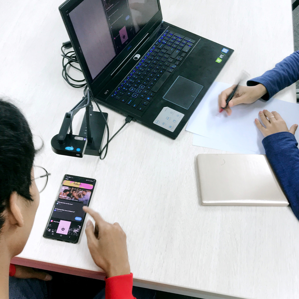
In a moderated usability test, a researcher meets with participants 1:1 either in person or over a video call and guides them through the study.
Benefits:
- High fidelity of insights — Researchers can ask follow up questions to gather deeper insights.
- Flexible fidelity of prototype — A lower fidelity prototype may be used since the researcher is present to clarify any questions on the prototype.
- Contextual observation — A lot of data shows you HOW someone did something but not WHY. When the researcher is present with the user, it’s easier to understand more factors, such as environment, and observe nuanced reactions that are lost in looking at data on the screen.
Constraints:
- Geography, time, and cost — In an ideal world, user problems would be solved by local teams who have deep insights into their environments and contexts. Unfortunately, this is not always the case, and it takes time and resources to meet the users in their natural setting.


