How to bring delight with the little things
As designers, we want to create delightful experiences that generate emotional connections with users. One way to make a product delightful is by using Micro-Interactions.
Micro-interactions are not uncommon, and you’ve most likely seen many examples in the devices, websites, apps, or any digital medium that we use today.
Micro-interactions are the little animations or visual responses users see when they perform actions. Their main purpose is to delight the user and to create a moment that is engaging and welcoming.
The structure
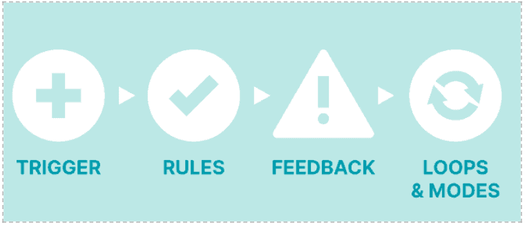
Micro-interactions are typically made up of four main components:
- The trigger that initiates a micro-interaction.
- The rules that determine what happens
- The feedback that lets users know what’s happening
- Loops and Modes that determine what actions occur during different stages of the experience.
Why use micro-interactions?
Micro-interactions add that delight factor the differentiates a product as a memorable experience which makes users resonate with a product.
“They can make or break the experience” — By Courtney Jordan
Now, we’ve seen this topic extensively discussed in design communities, and there are many incredible best practices that have been shared, but we feel there are 7 tips for better micro-interactions that will help you nail the micro-interactions in any product
7 tips for better micro-interactions
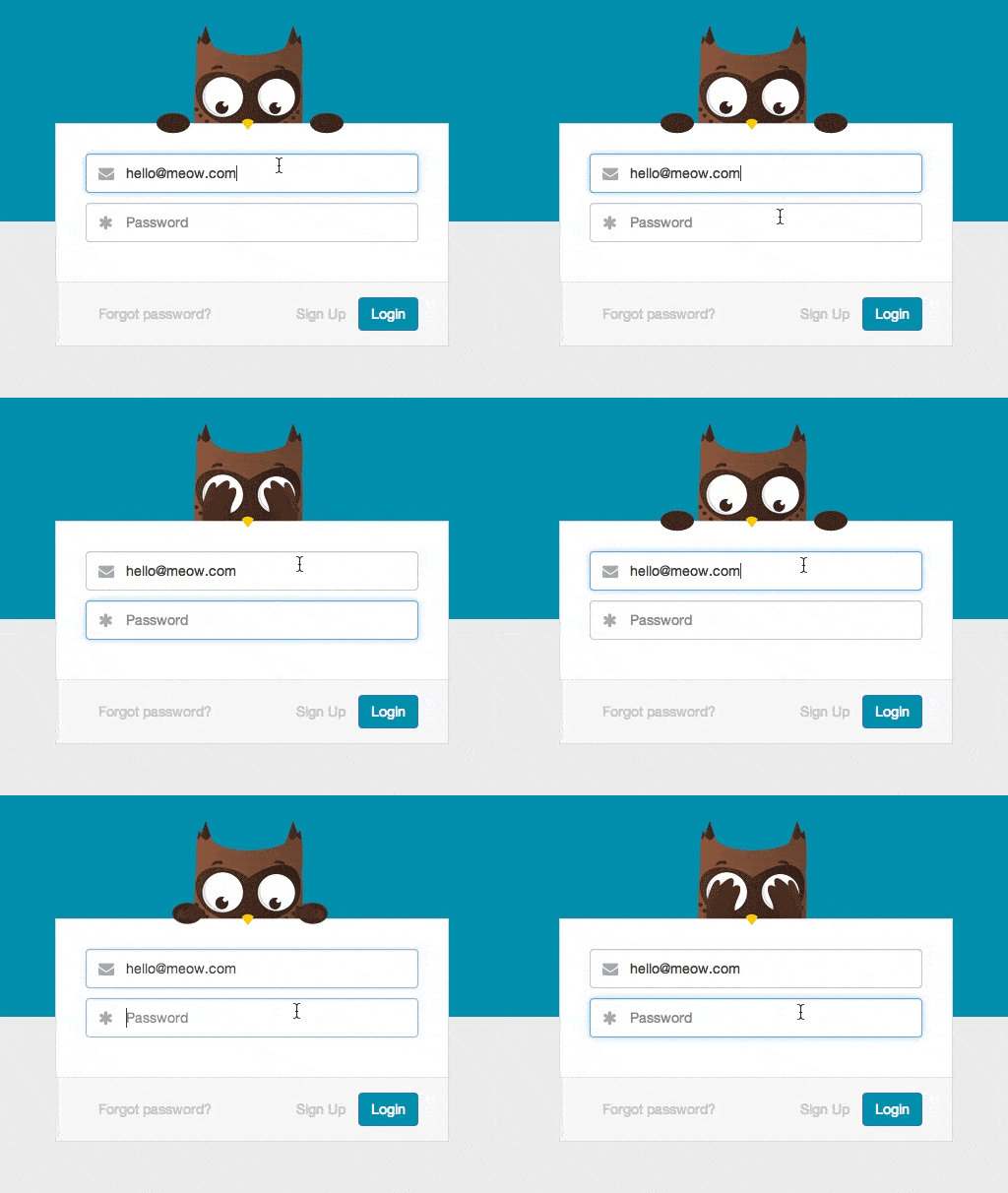
- Use familiar triggering actions that fit the context of the device — for example, in desktop experiences, triggering actions can be a click, hover, or scroll while in mobile experiences, they can be tap, swipe, or hold. Also, in mobile, the touch target for triggering should be always 10mm x 10mm whereas in desktop applications any interactive element should be more than 1cm x 1cm.
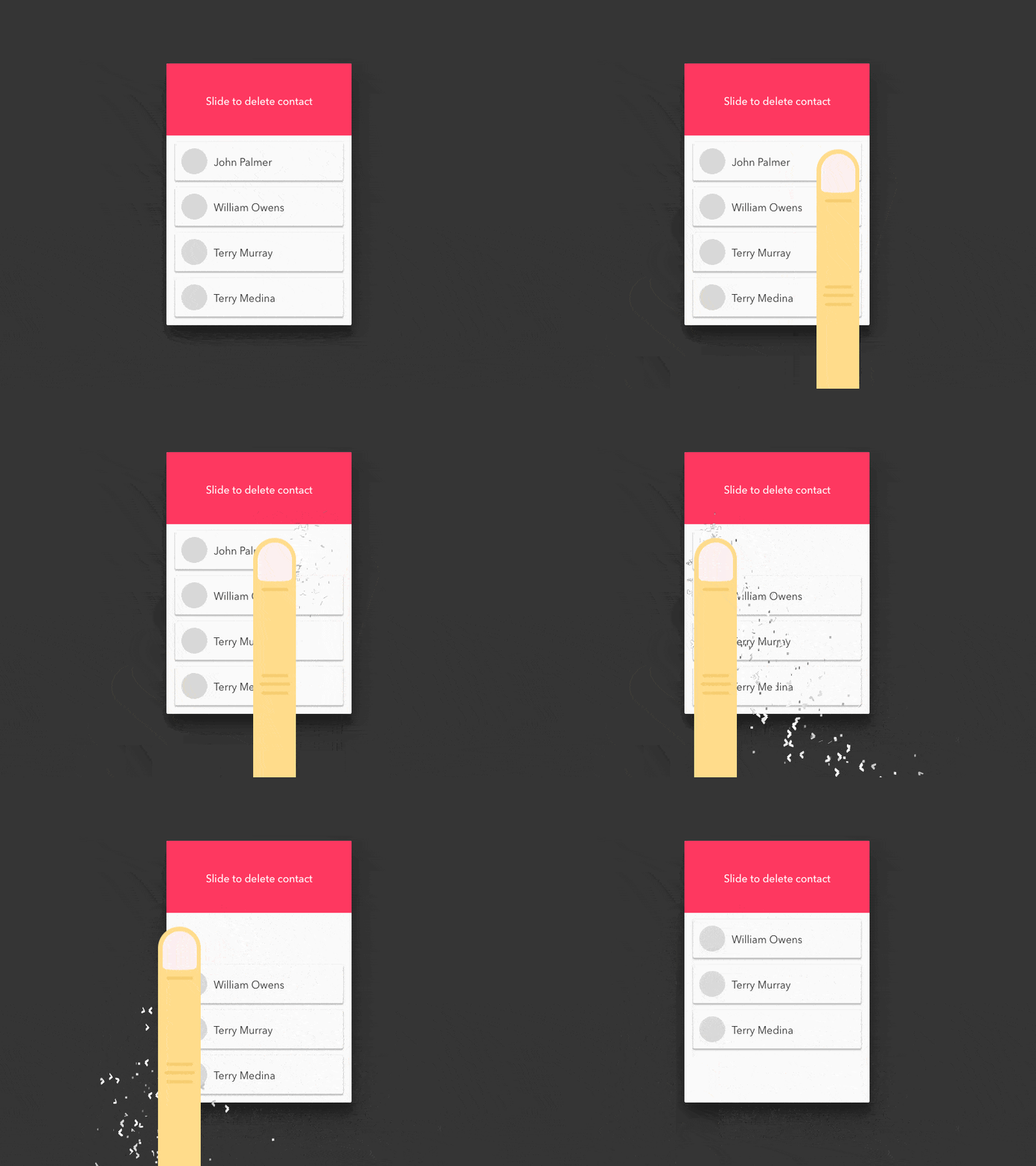
By showing the animated action, the user actually feels the experience of deleting something.
2. Differentiate between animations and flat interactions — these are the two main classifications but flat interactions are used more often as they are simple and provide convenient and easy interaction.
Example of Animation: The animation below uses motion to enhance the presentation and interactivity of the product.
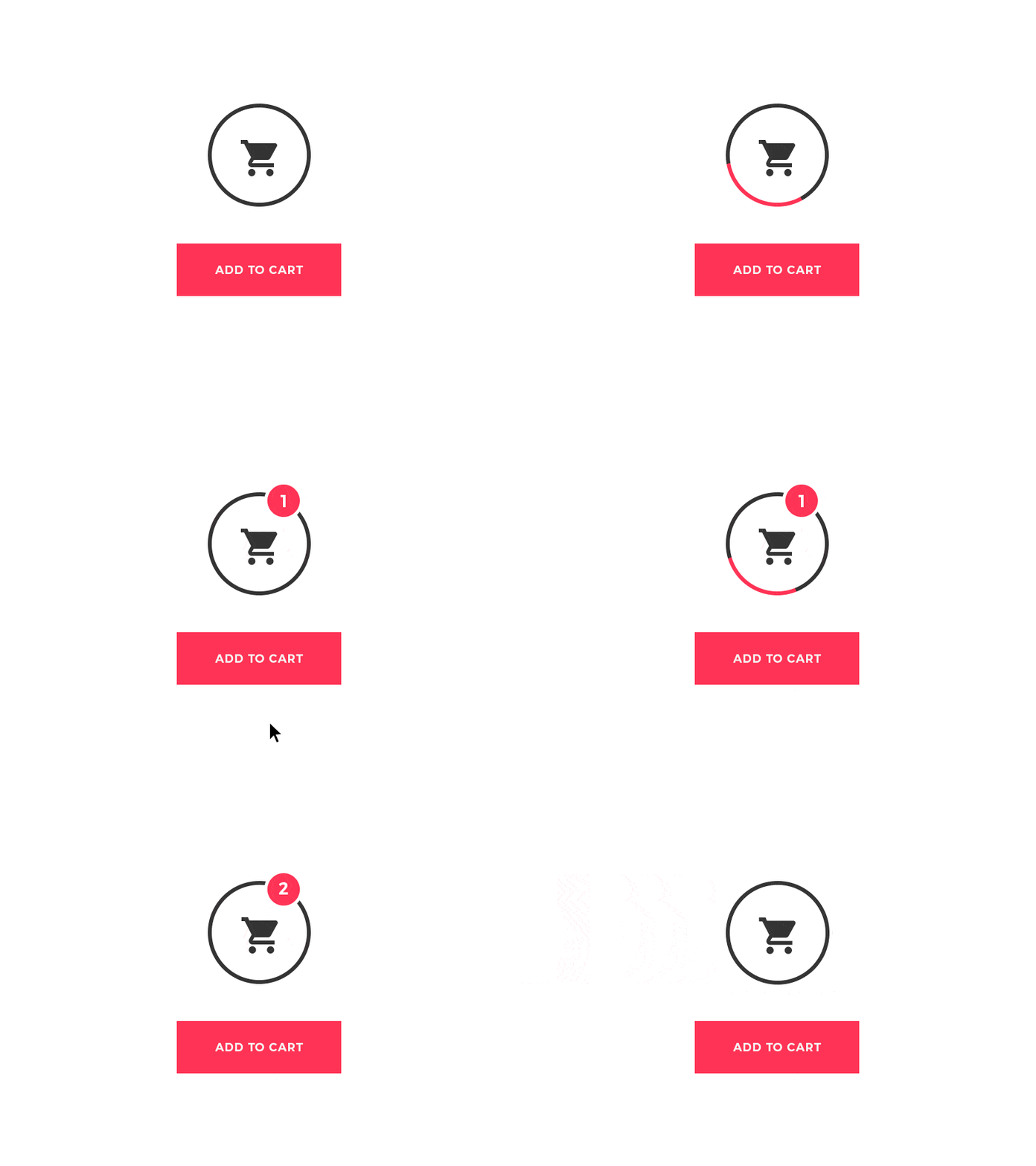
Example of Flat interaction: Simply speaking, flat interactions use 2-dimensional objects to communicate the interaction as seen below.
3. Choose the right speed — Animation duration should be in the range of 200ms — 400ms because animations that are too fast or slow cause distraction and may take away from the delight factor (eg; save, send, or download a file are good examples of a perfect animation).
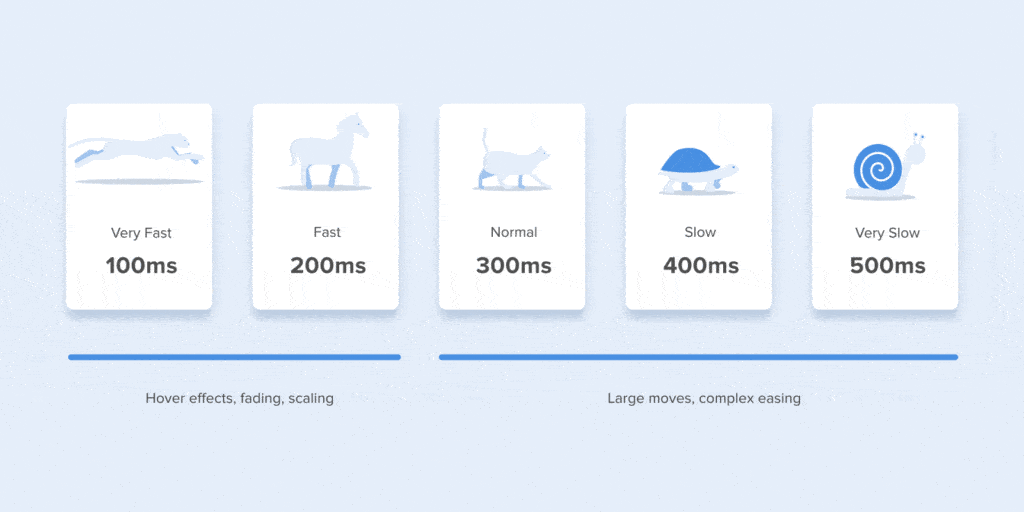
The example above shows the animations at different speeds. The elements & context define the animation’s speed. For example, a toggle switch animation should be fast whereas an animation for an error state should be slower as the user should understand what the error is and why it happened.
4. Be tasteful with how many animations you use — Too many animations on the screen can also be distracting/annoying to the user, hence we use flat interactions to show the result of the action directly without any intermediate feedback. The result should be shown within 3 seconds or even less. Eg: Toggle switch, CTA buttons. Etc

5. Give feedback as soon as possible — according to research, a delay of even 100 milliseconds is noticeable and annoys users.
6. Make transitions between interactions be seamless but noticeable enough. You want your micro-interactions to be delightful but not dominating. They should also integrate smoothly into the overall visual style,
7. Once the micro-interactions are ready, test and iterate until they feel right. It is very important to test with a group of people to make sure it is ready to build
Tools, we have many tools available such as Principle, Flinto, Framer, After effects, Photoshop, etc. Every tool has its own pros and cons so choose the one that works best for you!
Conclusion:
Attention to detail is what differentiates an exceptional eXperience from an ordinary one, so polish your interface from top to bottom by spicing it up with well-placed micro-interactions and animations. It will breathe life into your project.

