Should we update our product look and feel? Does it need to be more modern and sexy? More “WOW”? And if so, can we do it in two months or less?
We frequently hear questions like these from organizations that have taken an engineering-first approach and are now seeing user experience issues in their product.
And we understand why you are asking these questions. Perhaps the time has come to scale and you’re trying to figure out how to invest in the user interface (UI) or user experience (UX) of your product.
Chances are, you started building your product right off the bat without focusing too much on user experience, and for a good reason: time-to-value.
Your product has been out in the market, and it’s getting traction. But now that you’re getting serious about scaling, you may be receiving backlash from users and investors regarding the user experience.
Maybe over the years, you’ve “bulked up” the product and it’s become a bit clunky with a few extra features. Or perhaps the navigation bar has gotten a bit out of control. Still, these seem like minor issues; you’ve poured a ton of engineering resources into developing great functionality.
At this point, it may feel like updating or modernizing the UI will be the easiest and quickest fix to help you improve the user experience.
But we are here to tell you (honestly and respectfully): It won’t.
Instead of wasting time figuring out how to beautify your product, there are better questions that you should ask. Questions that will help you figure out if you have a product that can dominate your market.
We’ll dig into these a little further down. But first, let’s explore the relationship between UI and UX.
UI ≠ UX
When we look at the differences between UI and UX, the first and most important thing to note is that there are no pure user interface problems. Everything exists in the context of experience, and that experience is user experience.
So it’s not really about UX vs. UI, but rather about learning to take a broader perspective on your product challenges. Rather than hoping that “making everything pretty” will fix the user experience, it’s about digging deeper with your users to identify the root cause of — for example — low conversion rates.
Don’t waste time painting over a leak
Here’s an analogy. Imagine you have a visible leak in one of your walls at home. You don’t want to treat the symptom; i.e. paint the wall so the leak is no longer visible. That would be silly right? But imagine you do. You slap some topcoat over the leak. Only to realize a few days later the leak has spread across the room and now is also visible on the adjacent wall.
When user engagement is lacking in a product, it seems like the simplest fix will be to redo the branding/user interface; “pretty up” the look and feel. Add some bells and whistles. But a few months down the line, you’ll find that user experience problems are persisting. Engagement has not improved. And now you need to throw more money and time to go deeper and figure out where the leak actually is. This is where user experience comes in.
Unfortunately, we see many companies “painting over leaks” or, in other words, looking for a surface-level solution to their UX challenges.
Often, they’ll wind up in an engagement with an agency or freelance consultant who doesn’t have the experience to understand that a short-term, “visual-focused” UI solution is not going to be a long-term fix.
Questions to diagnose the root cause of your UX challenge
Instead of asking how quickly your product can be modernized, here’s what we ask to dig in and diagnose what’s going on:
- How much of the market share do you currently have?
- How much unconquered territory is left in the market? How many users are not using your product?
- Who are your best competitors, and why are people using their products more than yours?
If you aren’t (yet!) the market leader
…And perhaps only a niche group of users are using your product, it may be time to consider why the rest of the market is not. And why they’re using your competitor’s product.
Next, consider the following questions:
- How well do you know your users? Their pain points? Their journeys?
- Are you making decisions based on user insights?
- Are you actively user testing to validate your solutions?
If you aren’t 100% sure about your users: their needs, pain points, and journeys
…Then you may be having UX problems. Why?
Users rarely have just one touchpoint with your organization, product, or service and they resort to solutions in order to satisfy needs. User needs are about understanding what they’re ultimately trying to accomplish, regardless of the solution they’re using today. For example:
- User need: “I need to listen to music to feel motivated during my workout”.
In short, a user need explains why a user wants to go on a journey in the first place.
User experience is shaped by a multitude of interactions and a user journey illustrates this flow, providing a comprehensive, chronological recording of all the interactions, along with accompanying emotional states. For example:
- User journey: “I download and open the Spotify mobile app, create an account, search for a playlist that looks right, select the “pump up” playlist and start playing it”.
A user journey will help uncover what users are doing today and their highs and lows regarding current processes.
And these insights around user journey and needs are invaluable as you seek to diagnose the root cause of your challenge.
If you haven’t engaged directly with users to validate their needs and challenges
…You may not fully understand the problem you are solving for.
And if you aren’t actively testing your solution on users… it’s unlikely you have a handle on what a good solution would look like.
When we take the time to immerse ourselves in the user’s context, this is when we can begin to extract valuable insights to deepen our empathy for the user.
At UXReactor, we use research methods like in-depth user interviews, ethnographic studies, competitive benchmarking, etc. to gather these insights. We then apply those insights to evaluate the quality of the user experience.
A few years back, we collaborated with two ex-Telsa technology executives to develop a UX-first enterprise application for auto dealerships. Our partner, Tekion co-founder Guru Sankararaman shared:
User experience is not given a lot of thought in enterprise software. Whereas at Tekion, we were determined to build our platform in the most intuitive way possible.
Check out the full Tekion story here.
In short, if you want to go global with your product, taking the user interface route will not help you if you don’t have answers to the most important questions we’ve outlined above.
So, now what?
By now, you may be beginning to see that what seemed like a user interface problem actually has deeper roots in the user experience and may require a more in-depth solution.
This is good news! Because when a much bigger issue is just under the surface, any money you spend on UI projects will be 100% wasted.
And opting to “paint over the leak” rather than dealing with the root cause will result in lost revenue and business momentum. You’ll just be giving your competition more time to catch up and lure your customers away.
Think of undertaking a UX project as an investment that will set your business up for success in the long haul.
Determining a budget for a UX project
How much of an investment? Prospects often come to us thinking that taking the UX route will always require a huge investment of time and capital to update all parts of the product for all users.
It’s true that UX projects can be time-consuming and a significant investment. But when done right, this approach will yield greater results and ROI.
That said, if budget is an obstacle, we can gradually update the product over time, which breaks down the project investment a bit. Many of our clients opt to take this iterative approach.
If you are looking to determine a budget for your UX project, consider:
- The value of lost opportunities. What problem are you trying to solve that is leading to lost revenue? Do you have a user churn problem? Are you losing money? Users? How much is that costing you?
- The value of new opportunities. Think about the growth this investment will facilitate. What is the value of new opportunities this will enable you to capitalize on?
- The value across your organization. Which teams will get value out of this investment? Can they contribute budget?
Compared to revenues lost due to churn or revenue growth, PLUS the long-term competitive advantage of a complete product transformation, a $100,000 monthly investment, for example, becomes a lot easier to justify.
How a UX advantage earned this cybersecurity startup an acquisition deal with Microsoft
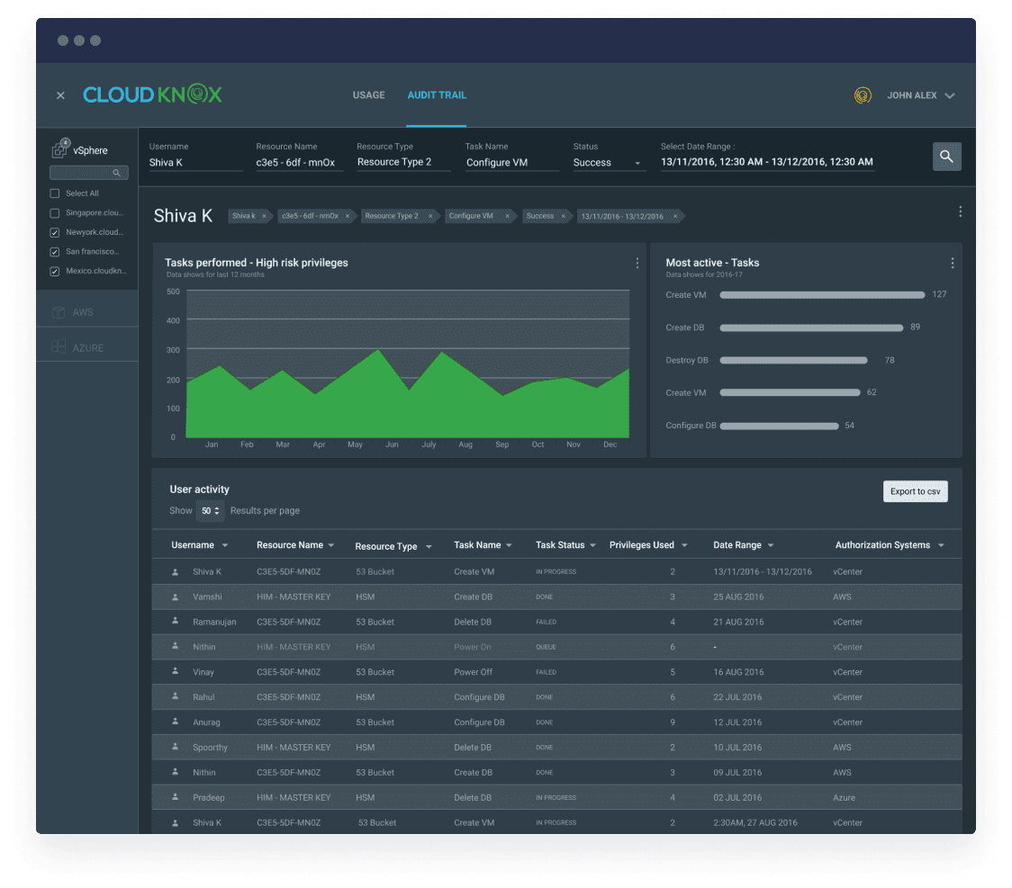
One of our cybersecurity clients–CloudKnox– proved the ROI of UX by winning an acquisition deal with Microsoft. In 2016, Balaji Parimi partnered with us on venture design for his cybersecurity startup.

We collaborated with the CloudKnox team to prototype an innovative product concept, and then validated it with advisors and customers before using the proven prototype to raise venture funds.
As the startup grew, our initial venture design stood the test of time: the system and brand remained essentially unchanged. And within just five years, Balaji’s CIEM was acquired by Microsoft.
Determining a timeline for a UX project
How long will a UX project take vs. a UI project? Well, you’ve heard it before: Rome was not built in a day. Compared to a UI project, with UX you will invest about 150% more upfront time for greater efficiencies down the line.
Alternatively, we can take that same timeframe and develop an enhanced most valuable product (MVP) with a UX approach. We’d start by conducting research, benchmarking and validation with your users. The research step is crucial because it will reveal the real problems we’re tackling and a clear path to success.
Once we are clear on the project goals and have accurately diagnosed the problem, we would then use the next phase to solve this problem.
Rushing things can result in messy shortcuts. But doing it right from the beginning can save you from headaches down the road. In short, it’s a smarter investment to spend the necessary time to reach your goal rather than putting bandaids on the problem.
In conclusion, the issue is rarely just UI… or features, for that matter. Best-in-class products and services are designed by teams who put users and experience at the center of everything they do.
UXReactor went beyond the user interface and vastly improved the user workflows
For Extreme Networks, one of our clients, what started as a UI refresh became a UX redesign– and experience transformation over the course of six months. Wendy Kastner, Head of Design, shared,
UXReactor far exceeded our expectations. They went beyond the user interface and vastly improved the user workflows while crafting a new and much-improved user experience for our complex enterprise application.
Ready to get to the root cause of your product challenges?
Request a consultation and we’ll start exploring your product challenges together.


